Wednesday, 15 April 2015

Comparing Miss Havisham and Queen Victoria


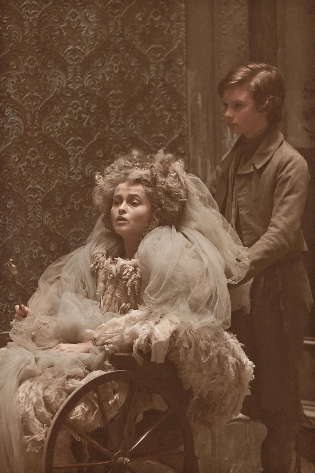
Two women both with tragic stories and both wealthy. but the famous 'phrase money can't buy happiness' seems to apply to both. heart broken and devastated these women have a lot of similarities. Even just from these images although one being a re-enterpretation with Helen bon carter to represent Miss Havisham the emotion both images provoke are very similar. You can feel their pride, their sorrow and you can't deny that physically the aesthetics they both chose for their imagery and representation was very similar. Both happy to boast their wealth. One thing that i would say does draw them apart is the fact Miss Havisham was able to stay and taunt herself with her past a lot more than Queen victoria. Queen Victoria was forced to continue with her duties to her country and as a woman figure.

Vivienne Westwood- red label Kabuki Diva

2013 autumn winter London fashion week
Vivienne Westwood-  red label Kabuki Diva
dramatic tendencies
outlined the face with kabuki features then filled in the spaces with acrylic paints in PRIMARY TONES

models nails air brushed with rosy paint that extends up the fingers
HAIR
 referencing of madonnas strong empowering image showed off a super sexual and glamor as vibe.


THE LOOKAS A MOOD BOARD
THE IMAGES I BASED MY INTERPRETATION


from these mood boards and the brief of information i knew i would be using supra colour pallet and as they were primary colours it wouldn't involve too much mixing to get the desired colours.

This is my interpretation. I am pleased with my work and I like the way it reflects both the work i have been studying but I think in my own way. The main problem i faced whilst doing this look was the texture of supra colour although the colour is bright and very high pigment which is ideal with this look the consistency when it gets to warm means that it can print, smudge and blend a little too easily. so for instance on the eye lids where there were primary block colours very close to each other when she blinked they were starting to bleed into one and other. in an ideal world your model wouldn't blink but unfortunately i don't think thats a very viable way to improve my work. Instead I have thought if i was to repeat this look again I would powder with translucent loose set Illamasqua powder to set each layer. 

 After I had finished we swapped round and my model Daniella also interpreted this look on me

Monday, 23 March 2015

Claudia and Quentin re-brief

So whilst developing ideas on Claudia and Quentin i hadn't thought to wait until we actually started this part of the project with the class. WHAT CAN I SAY I GOT EXCITED ALRIGHT?! Unfortunately this means that some of my previous ideas have to be scrapped  but i think this has actually worked in my favour as analysing what i have already written about it is very scattered all over the place.

The re-brief, on top of what i had already learnt about the character profiles, taught me that the characters have to fit into another gothic horror TV series rather than creating our own TV series for them.

so whilst also keeping in mind my previous research (although its not as relevant) I need to select a gothic horror TV series and research its concept. We have been given this list to choose from.

The Walking Dead
American Horror Story
Dexter
True Blood
Bates Motel
Buffy the Vampire Slayer
Vampire Diaries
Penny Dreadful
In The Flesh
Being Human
Hemlock Grove
Hannibal

Most people In my class were jumping with joy at this, but truthfully, I haven't actually watched many of these series. Honestly Not many of the series screamed out at me when researching until I saw the trailer for Penny Dreadful.

Tuesday, 17 March 2015

Meet Claudia. Meet Quentin. They are in love?


At this stage of the project we have been given a lot more freedom to create our own characterisation within the brief. Rather than with characters from great expectation which was quite strict with what we could and couldn't do.  Also with this section we had the advantage that we had learnt a lot already from our great expectation brief, the techniques and a lot of ideas from the T.V series, film, gothic horror text and general historical references which could defiantly influence our ideas and designs of Claudia and quentin. as i have learnt throughout this project a lot of the work when creating deigns is characterisation. so when creating my designs for Claudia and quentin I really looked into the brief itself a lot more than admittedly i had in the past. The obvious part of the brief that is important to this was the character profiles.


Claudia
Claudia is a girl in her twenties. As a child she was left alone to develop with little parental guidance and through her relationship with T.V. movies developed an unhealthy relationship with Horror films, believing this to be the way life really is.

All the scenes take place in various parts of Claudia’s apartment, She is agoraphobic and is kept in touch with the outside world by her neighbours who provide her with her every day requirements.  She models herself on a variety of girls often twisting her look to suit whichever film she is watching at the time and there is often a nod to the main character in the current film within her appearance.

The script portrays her as psychotic and there is always the feeling that although her character is scripted/can be seen as humorous, danger is just around the corner.   However all this is normal to Claudia and she is of a cheerful disposition in this mad world of hers.

Quentin
Claudia has an imaginary boyfriend, Quentin, who is long suffering and a constant disappointment to her. They don’t live together but he visits regularly and they talk on the telephone if he can’t get in to see her. As he is part of her imagination his appearance changes to suit her mood. 

He is as into the horror film genre as she and into role-playing to suit her whims and moods.
Claudia has a paranoid suspicion that he is constantly having affairs behind her back and keeps him firmly under her thumb, sometimes restraining him or keeping him prisoner in one of the rooms.

whilst creating MY interpretation of Claudia i thought that in my version her appearance wouldn't reflect exactly the show or film that she was watching at the time, but instead she would dress the way her emotions provoked her to and it would reference elements that she had seen in gothic horror. From this idea i brain stormed different emotions and how she might relate them to gothic horror characters or themes and how she may then interpret that into her make-up and clothing decisions. as quentin is a figment of Claudia's imagination i think that his appearance would also make sense to reflect her mood, therefore they're appearance might match, in the same theme coming from different gothic horror inspirations.

inspiration for face charts for Claudia:

JOYFUL CLAUDIA AND QUENTIN

i thought that when she is in a playful happy mood she might reflect the sense of the creepy clown often featured in gothic horror. looking into this idea i came across some beautiful clown interpretations done by Natasha Lilipore. this then led me to think about what kind of clown she would make herself into. what is her interpretation of beautiful? Natasha as a make-up artist has clearly thought through this process herself as there is three different types she seems to take on. the middle one being a very modern interpretation which is actually still very stunning, the right being very artistic and more of a body paint. The left is actually my favourite and i think the most appropriate take on the clown for Claudia as its not typically beautiful and its not a straight copy of any clown but quite distressed and fun, with the sleigh creepiness that gothic horror brings.


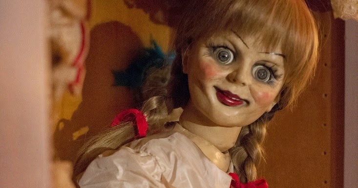
this is a very fashion interpretation though and to gather other research i looked int o gothic horror doll's which brought me to those famous big creepy eyes so twisting the left image of natatsha and the creepy eyes and red lips i have started getting a clearer image of this character version of claudia.


As i previously stated i want to incorporate the characters together depending on claudias mood so when she is playful i thought it would be more than appropriate to draw inspiration from saw, and the jigsaw mask. after all he was already asking do you want to play a game?


RELAXED QUENTIN AND CLAUDIA.

i thought about what might actually happen in the TV show and realistically with all TV shows set in apartments, there has to be just a relaxed mood, where they sit and do nothing together. so for me relaxed claudia would be the ultimate gothic horror character that every girl weirdly wants to be.... wednesday adams! the look I think i will be drawing on most is defiantly wednesday adams to me she couldn't fit Claudia's brief any better. This is the life she knows and is comfortable in a world were horror and gore is wonderful and she can feel comfortable.

and for quentin whilst Claudia becomes an interpretation of Wednesday adams who could be more appropriate than Frankenstein? obviously not the extreme version bolts, scars and green face. no not the hole shebang more the concept of frankenstein. the large broad brooding figure obliging to demands and ultimately pretty much grunts, wednesday adams perfect man really. i would still like to incorporate the death mask look and a few scars that Frankenstien's image includes as i think in this Claudia and quentin Claudia is defiantly weirdly attracted to horror and I don't think in her imagination a typically attractive guy like David Beckham would be her 'type'. 

LUSTFUL CLAUDIA AND QUENTIN

horror is obviously not the most romantic genre but to me within the genre the most romantic kind of horrors are vampires they are lustful and loyal to there men. I think fitting with the fact that Claudia is freaking out that quentin is cheating on her maybe this is the one for of quentin that Claudia does Imagine a more typically handsome man, someone she thinks she can't trust. so I'm thinking about different movies and Van Helsing suddenly pops out at me, but instead of choosing any of the existing couples within the film maybe pairing the ideas of a women vampire and van helsing ?


SAD CLAUDIA AND QUENTIN 


As the emphasis is on developing my skills in gothic hair and make up, I am expected to record several test shots to establish the look most suitable for the characters. At this point the character choices for Claudia would defiantly be between the clown inspired look and the wednesday Adam's inspired look. which ever I choose I will then pair this with the Quentin character that matches.
Monday, 9 March 2015

Miss Havisham continuity second half

The second half of the continuity assessment was defiantly more daunting than the first as every thing had to be the same. to help me with the assessment I brought with me pictures of the front back and both sides from the first assessment.


Wednesday, 4 March 2015

Continuity Assessment Miss Havisham - The first


 Product list:
sectioning comb
paddle brush
hair tie
hair curlers
pins
hair spray
heat protection spray.
sectioning clips
fake flowers
Illamasqua skin base primer
illamasqua skin base white foundation
Kryolan foundation
M.A.C limeted edition kiss the king
disposible lip brush
Illamasqua loose powder
Kryolan blusher.

THE FIRST TIME

The process of miss Havishams make-up:
1. cleanse tone and moisturise the face.
2. mix the kryolan foundation with Illamasqua white foundation and primer.
3. apply this base all over the face.
4. powder the hole face with Illamasqua loose powder.
5. make the model smile and apply the kryolan blusher to the apples of her cheeks.
6. using mac lipstick and disposable lip brush apply all over the lips
7.Using your finger smudge the lipstick across to the side of her mouth.


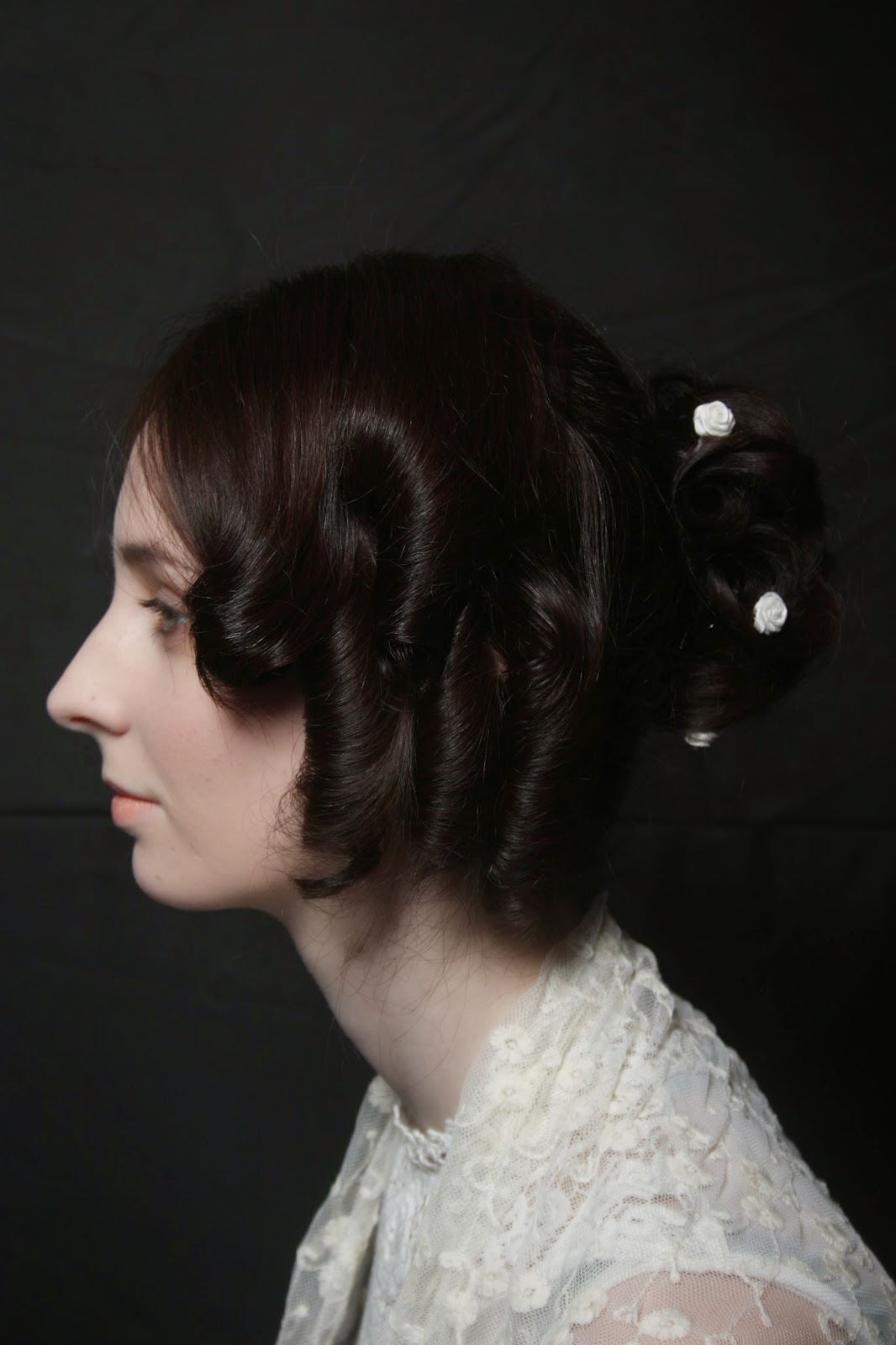
The process of practicing Miss Havisham hair:
1. brush through the hair with the paddle brush until hair is smooth of knots
2.section about four fingers worth of the front of the head from the back section with the pin tail comb.
3. tie the back section in a mid height ponytail. make sure it is firm and tight
4. section the front centrally down the middle with the pin tail comb and hold in place out of the way with sectioning clips.
5. turn on your curlers to heat up
6. spray through the pony tail with heat protection.
7. take small sections and curl the hole pony tail in small indervisual tight curls in different directions.
8. go through the pointy tail taking each curl and turn it in on itself and pin.
9. do this with the entire pony tail building curls upon each other until it forms a bun.
10. take one front side down and section it again down the middle leaving the longer section free below the ear and pin back up the top section again.
11. make three curls in the bottom section.
12. release the top section and do a further three curls.
13. do this again on the other side.
 14. take 5 of the fake flowers. put one directly in the middle if you can.
15. using the remanding 4 flowers space them equally around the outside of the bun.
16. secure all of this with hairspray.


Digital Image Perfume shoot


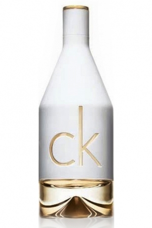
so, the second part of our digital image project was to choose a perfume and create an advertisement image to promote this perfume. I chose CKIN2U, in all honesty to start with this decision was because i know the product and i like the appearance of the actual bottle, also as its gold and white i can pretty much go in whatever direction i wanted with the imagery.


but then i thought about it and to accurately represent the brand i needed not just to look at the product itself but just as we did with lime crime in the previous shoot to explore previous imagery CK perfume advertisements have used. 


to start with i was really drawn to the eternity adverts and defiantly thought i could incorporate this into my location, i defiantly wanted to shoot inside. this would avoid a lot of blunders such as weather making interference to my shoot. there are a lot of eternity adverts with couples which i took this comforting vibe


i then looked at poses that the eternity ones had for just women. whilst looking at these images i also studied the styling and noticed the basic make-up and natural beauty look with very clear skin. i also noticed that they are in comfortable relaxed poses.

the other striking image i found was of Kate moss for the obsession cologne now obviously this isn't a perfume but its still the brand i found it helpful to look at both types of advertisement and it still has quite a similar vibe just less comforting and more striking. i didn't want nudity for my perfume shoot as its a younger more fun smell but at the same time this image made me take note that all the models have very athletic figures this was something to take into consideration when choosing my model.

obviously i saved the most obvious advert to look at until last so it didn't influence my ideas too drastically. after all i don't want to copy. but it also helped to see imagery that was in colour as after all i would have to be shooting in colour too. this also showed me that as far as branding is concerned  CKIN2U is advertised much less serious than some of the others and is based at a younger audience. i didn't really see this as much of a problem though as thinking about who i may choose for a model they are all very youthful bubbly looking girls who fit this criteria. 

So eventually I decided on a location of my model Jo's room this way i knew she would feel comfortable and relaxed as much as possible. I chose to style her in low ride jeans and a sports bra as it fits the athletic sporty look that CK prides itself on without her becoming nude and less CKIN2U playful. 


whilst shooting to create more light in order to get better quality pictures i surrounded her with fairy lights. this also added something a bit different to the image. i shot both with and without but these two pictures were by far my favourite, the positioning within the image frame is ideal for negative space for the product and text and my model looks gorgeous. i am happy with how these pictures went in the end now its just time to edit.